Wednesday, February 27, 2008

Perspectives...


In my design I know I want to keep everything very simple and functional with an easy flow. I also want to keep as much open as possible. In this stage I am still working on my color scheme and materials. However I know I want to use glass and concrete.

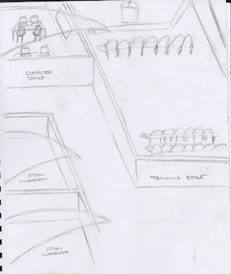
Brainstorming for CNNC


The architect Santiago was a huge influence in my design. The use of glass and arches really inspired me to incorporate that in my design as well.


Here I tried to incorporate my inspiration with my concept of hidden and exposed.


Wednesday, February 20, 2008

Nostalgic Remix


i chose these two ads because they both have the grandma print look. The jacket especially. Even though the first one uses bright colors, they both have a vintage look as well.

Bauhaus Ad


Bauhaus was a hard advertisement to find. I chose this one mainly because of the geometric shapes and that it is not centered in the page.

Pop Art Ads


The ipod advertisement is a more current outlook on pop art advertisements.
The contemporary foods ad is an imitation of Andy Warhol which was an pop art artist. The lips of the mouth are the main focus.
The last ad is an advertisement for whiskey which reads like a comic book.

Retro Modern Ads


I chose these two ads for Retro Modern because they both came from the 50's. They are very colorful and exciting looking.

Wednesday, February 6, 2008