Friday, May 9, 2008
Final CNNC Presentation
Our concept for the design of the Center of New North Carolinians is power of the square as well as hidden and exposed. We expressed these concepts through materials, furniture and lighting. Our goal is to make the immigrants feel welcome and comfortable.

For the office space we wanted to create a more personal, homey feel. We chose a dark carpet with natural colored bamboo furniture. A blue accent wall is located on the desk wall to add more color and break up the neutral walls. For lighting we used a square ceiling light, desk lamp as well as natural lighting. Clear story windows are also used in this space to allow more natural light and also to make the immigrant not feel so closed in.

The design for the conference space is to create a place functional for small groups of people. An 8'x6' natural bamboo conference table was chosen. The chairs are covered in a light colored print to add contrast with the bare walls and green accent wall. Shelving, dry erase boards and cork boards were placed in the space. Suspended lighting panel is used as well as the clear story windows.


For the reception area we used a walnut bamboo flooring to add contrast with the natural bamboo furniture. We chose sectionals, couches and chairs for visitors. Lots of natural lighting from six large square windows. Suspended panels are also used for lighting over the seating areas. For the reception desk we wanted it to feel welcoming but also different than anything else in the space. We chose to put a curve, obviously because it is not used throughout our design, and it is welcoming and guides you in a direction. On the curve we chose a corrugated metal to contrast the natural bamboo. Frosted glass is raised three inches to give the hidden and exposed look. The receptionist desk is lowered to give more privacy.

For the office space we wanted to create a more personal, homey feel. We chose a dark carpet with natural colored bamboo furniture. A blue accent wall is located on the desk wall to add more color and break up the neutral walls. For lighting we used a square ceiling light, desk lamp as well as natural lighting. Clear story windows are also used in this space to allow more natural light and also to make the immigrant not feel so closed in.

The design for the conference space is to create a place functional for small groups of people. An 8'x6' natural bamboo conference table was chosen. The chairs are covered in a light colored print to add contrast with the bare walls and green accent wall. Shelving, dry erase boards and cork boards were placed in the space. Suspended lighting panel is used as well as the clear story windows.


For the reception area we used a walnut bamboo flooring to add contrast with the natural bamboo furniture. We chose sectionals, couches and chairs for visitors. Lots of natural lighting from six large square windows. Suspended panels are also used for lighting over the seating areas. For the reception desk we wanted it to feel welcoming but also different than anything else in the space. We chose to put a curve, obviously because it is not used throughout our design, and it is welcoming and guides you in a direction. On the curve we chose a corrugated metal to contrast the natural bamboo. Frosted glass is raised three inches to give the hidden and exposed look. The receptionist desk is lowered to give more privacy.
Thursday, May 8, 2008
Sunday, April 13, 2008
Tuesday, April 1, 2008
Thursday, March 27, 2008
Tuesday, March 18, 2008
CNNC Presentation Boards


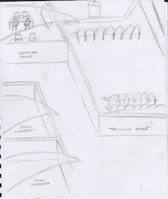
For my design of the CNNC building was to create a hidden and exposed design. From our many interviews with CNNC staff we learned that they were in need of large public spaces as well as private office spaces. Another factor I considered was that the immigrants did not like to be in enclosed spaces, it makes them nervous and uncomfortable. For my private spaces which were mostly the office spaces, I enclosed with ceilings at 11'-6". However the public spaces I either left completely open or used glass walls. Most all of the class rooms and conference rooms have a glass wall to make the space seem more open. There is also a glass arched ceiling over the class rooms and conferences rooms to tie in the arched vault as well as the exposed concept. I chose concrete flooring with the exception of carpet for the private offices. My choices of color I wanted to feel exciting, fun and inviting. I chose to use mainly neutrals with splashes of color using a light teal and a burnt orange.
Tuesday, March 4, 2008
Wednesday, February 27, 2008
Perspectives...
Brainstorming for CNNC
Wednesday, February 20, 2008
Nostalgic Remix
Bauhaus Ad
Pop Art Ads
Subscribe to:
Posts (Atom)


